


For the first part of this assignment, I was not a huge fan of the automated design of the images using the text. I felt that in order to have real success with the images, you had to have just the perfect lighting, contrast, and color to create something that was recognizable yet creative. I also did not like that the images had to be taken in landscape in order for the text to be in the correct direction. Of the three converters on the text-image.com website, I like the HTML setting the best. I think I liked this because you could type in the words that would be used to create the image. For the matrix converter, I had to use the add contrast selection to be able to make the image pop more.


WordArt: Wally the Goldendoodle
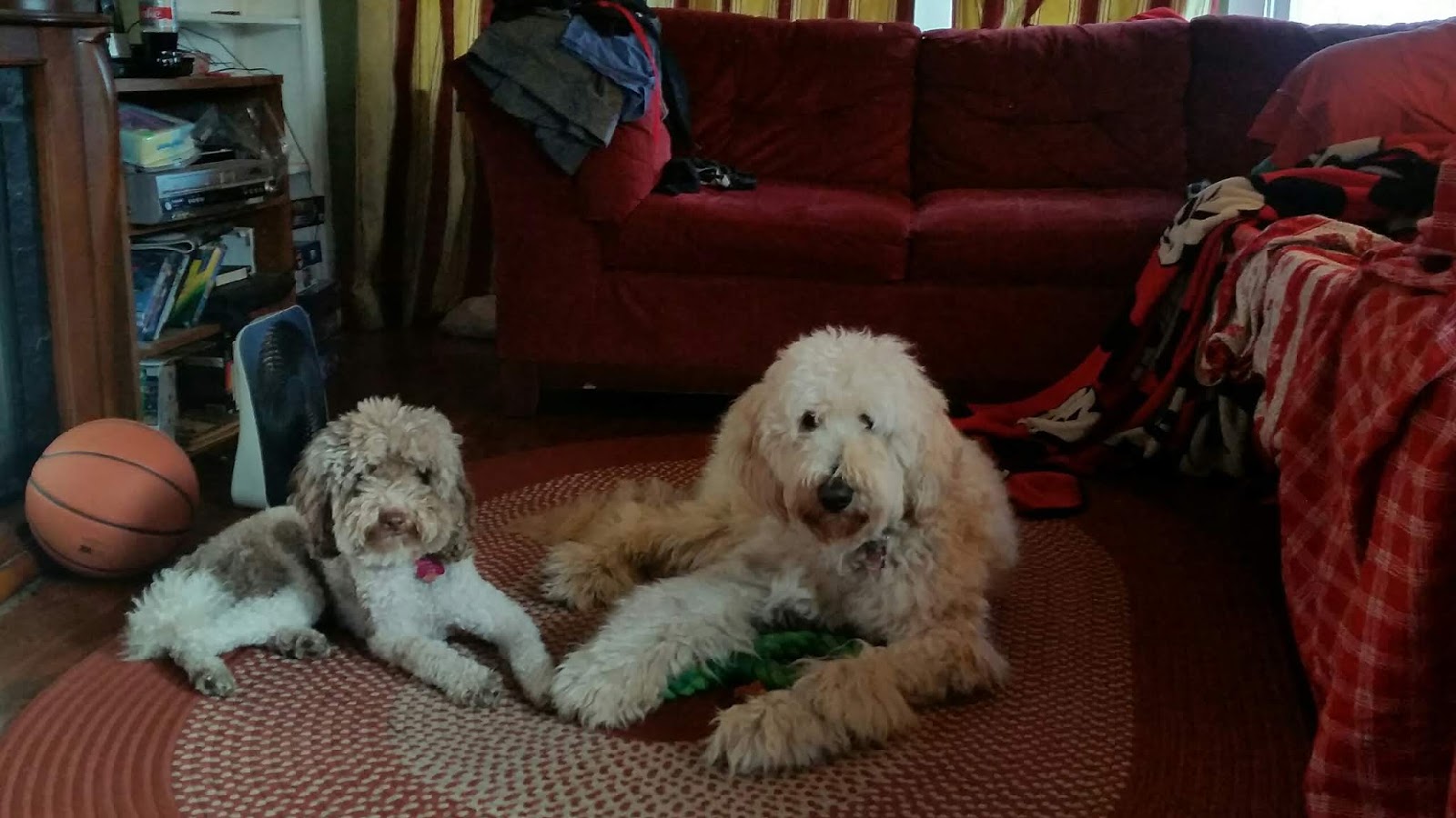
I liked this converter much more than the ladder websites. I liked how you could use a pre-set shape or create your own from an image (as I did here). You had plenty of options from text direction, size, and type of font, you also got to choose your words. Here, this image is of my.family dog Wally. I used words that described him including his name, breed and his characteristics. The hardest part with this was, since I was using my own shape, getting the right setting with the picture to allow the words to fit well within the shape. This creation of word art has the most potential because you can change and control almost every aspect of the art.


I liked the use of this website as well. Again, you had a lot of control over the customi
zation from the words used to the opacity of the image behind. For textorizer 1, setting the threshold to 0 and having a high number of strings created the best result for me. The words I used here were jellyfish, ocean, contrast, and beauty for I felt those all described the image well. I had to do a lot of playing around with the settings to get a good image. I also found that brighter images created the best results as I originally attempted using the image I used for excoffizer with the texturizer and it was turning out too dark. For texturizer 2, I made the font larger, line height between lines smaller as well as making kerning more positive. I like again how you could insert your own words to be used and I used the first lines of the song Beyond the Sea because the ocean picture reminded me of Finding Nemo and that song plays during the credits of that movie. My least favorite of the three was the excoffizer converter. I had to stay away from making the lines look like they were moving because it was making me feel sick, but it is a cool concept for those that can handle it Haha. Overall I think these creations were the most successful of the 3 assignments this week.
Comments
Post a Comment